Tuesday, December 22, 2015

Jack's Gif Reflection


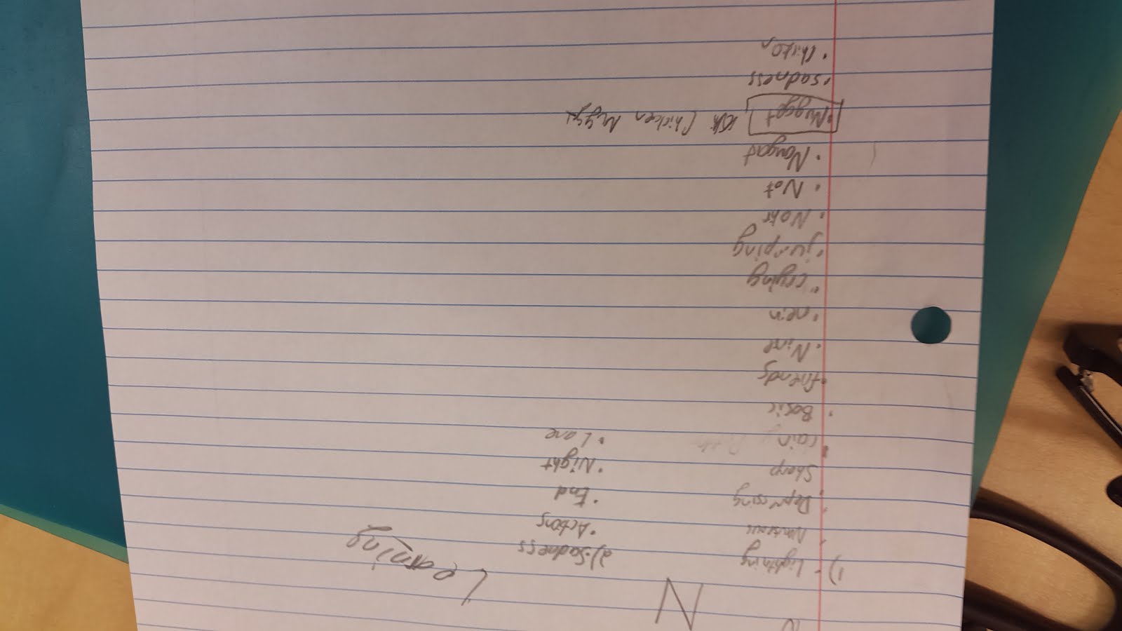
My self symbol is that many people view me as an angel, as a nice and caring person, while in reality I am a devil, a sarcastic judgmental guy. I thought about how all my friends thought that I was a very quiet and nice person when they first met me but they were surprised to learn that I was really sarcastic and loud. My image relate to my concept because of how I tear away the fake costume that I first wear. A fake angel. 

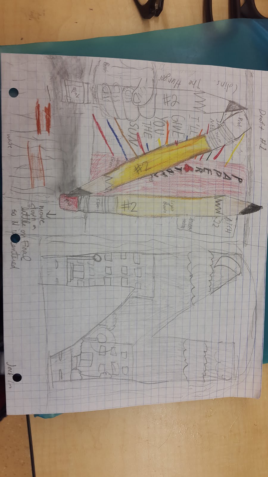
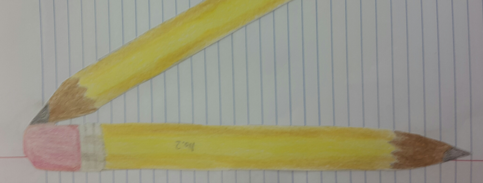
My original idea from my post-its was too simple with the only change was me gaining devil horns. I decided to show how my overall aura should also change from a pure white to a bleak red color showing how different my "fake" and "real" self is. Another idea I got is that I show my true colors when people get to know me better which is why the black slowly covers my clothes. I slowly become who I really am. The white color being my fake identity while the red color is who I really am. 

Sunday, November 22, 2015

Failing Myself


Failing Myself

1. My concept is how I (the colorless me) am trying to catch myself (who has color), who is falling from a tower in the skies. The idea is that I failed to save the last bit of color and now I am only a  black and white shell.

2. I am incredibly happy with my results because of how it was, in the beginning, incredibly hard to do, messing up a lot of times throughout the whole process, but in the end I was able to finish. I am proud of coming up of a dramatic idea that portrayed my ideas and thoughts.
                                                        

                    ^            
                     |  (this image)
3. I used numerous layer masks to easily erase some parts of the layer's background, to show the layer underneath it. This was made so the erasing would not be permanent, the mask was easily disposable if I was unsatisfied with it. I had made many layer masks, which one them was for erasing the background of me "falling". First, I had gotten a separated background onto a layer on Photoshop. Adjusting the image size and resolution, so it could fit well onto the new layer. Next, I adjusted the image of me "falling" so it would not be too pix-elated. Then, I copied and pasted the picture of me bending onto a new layer, being above the previously made layer. I then clicked on "layer" tab, near the top, and clicked on add layer mask. I chose reveal all, so I could erase the portions of the picture that I did not like. The layer mask should be directly next to the layer. Next, I used the magnetic lasso tool to outline myself, and then I clicked on inverse. I then clicked on the layer mask, not the layer, and erased all of the background, until only I was left.

Thursday, October 15, 2015

Letter Project Reflection

Letter Project Reflection
1. I think the process helped immensely in helping me think of what object should represent the letter. Overall, it helped me be a lot more organized since I had a plan at the end of the brainstorming process. While I was looking around the room to find an object to draw, I dropped my pencil on the floor. When I picked it up, I noticed that, when I said it out loud, there was a n in pencil. The peer review did help because other people gave me advice on how to make the pencil stand out more, and how it should be placed on the piece of paper.

                                 
2. I made three pencils and connected them so they resemble a N. In addition, I also overlapped the pencils so they looked like a N, rather than making one pencil, having an awkward structure.


3. The most challenging aspect of this project was the whole brainstorming period. I could not think of anything that I enjoyed to make into my letter. There were many ideas but I wanted to find a word that could easily become the letter without risking the letter becoming lost. It is usually already hard for me to think out of the box.

  4. I am incredibly satisfied of my project because I can clearly see what does N symbolizes, and the N is clearly shown. I like how creative I was in putting the pencils on loose leaf which, I think, made my project a lot more different. Because other people colored a background, I actually used loose leaf rather than drawing it in the background.

5. If I could change anything about the idea, I would probably blend in more colors, to make the pencils look a little more realistic. The pencil could use more shades of yellow and brown. Also, the eraser could have more shades of red, so the eraser could have looked more realistic.

Thursday, September 24, 2015

Graphic Design Homework #1

Hi, the name's Jack. I really enjoy playing video games so much that I would rather stay indoors the whole day rather than out to continue playing. I don't really have any favorite sports except for jogging.

I spent a lot of times in the summer just hanging out with friends, and just catching up with my old ones, surprisingly because I love staying in. This was a picture outside my friend's place after I hung out with my group to play video games. I think this was around 9th street, and I took the picture because the sun was very pretty.


I went with a couple of friends to watch "Papertowns" because I read the book, and highly like John Green books and his previous movie "The Fault in Our Stars". During most of my summer, I watched a lot of movies with friends. This was around the 42nd street's AMC.

I spent almost everyday with my dog, Yuki, because I had summer school during most of August, and couldn't hang out.  This took place almost the whole summer, and this picture was taken at my home. 

                                                                                                          -J